
Asgard Clothing Co.
Performance Activewear Brand
Fashion / Apparel • Branding
Understanding the Vision
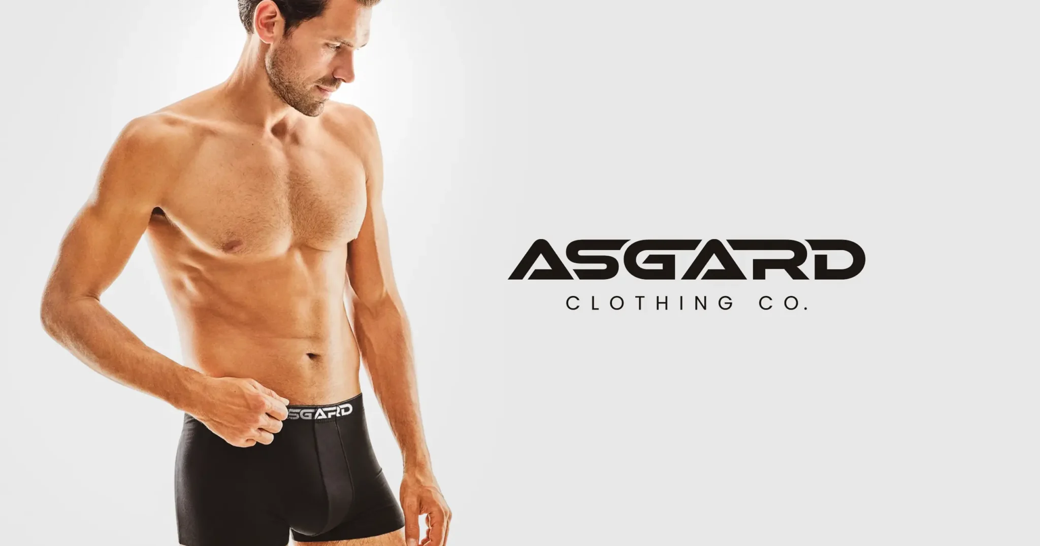
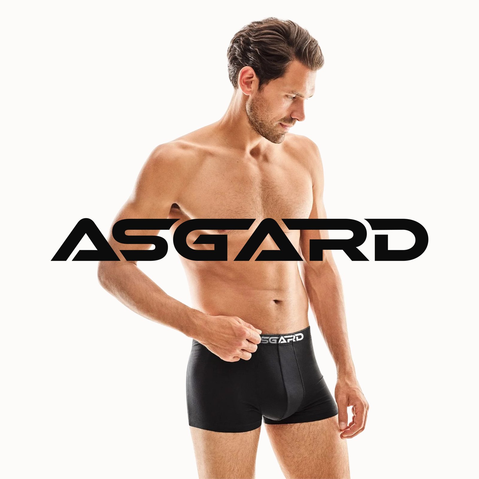
Asgard Clothing Co. needed a brand identity as powerful as its name suggests. In the competitive men’s activewear market, the brand needed to communicate strength, precision, and premium quality while standing apart from generic sportswear brands.
The identity had to command presence everywhere — from product tags and packaging to e-commerce platforms and social media — while maintaining a clean, minimalist approach that lets the product quality speak for itself.
Strategy & Creative Direction
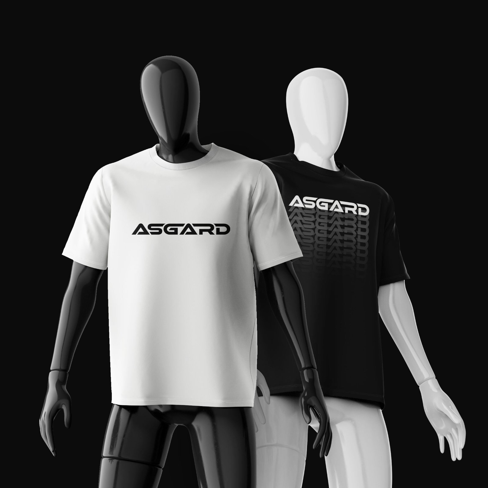
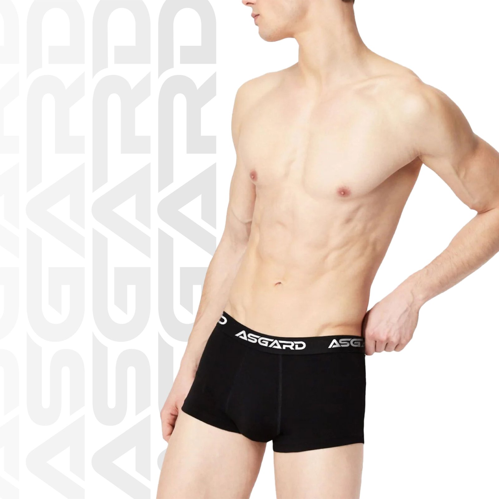
We drew inspiration from Nordic design principles: sharp, clean, and purposeful. The typography was designed with athletic aesthetics in mind — angular letterforms that convey speed and strength without sacrificing readability.
The minimalist approach was intentional. In a market full of over-designed, busy branding, Asgard’s clean identity creates a premium perception that positions the brand above the noise.
Bringing It All Together
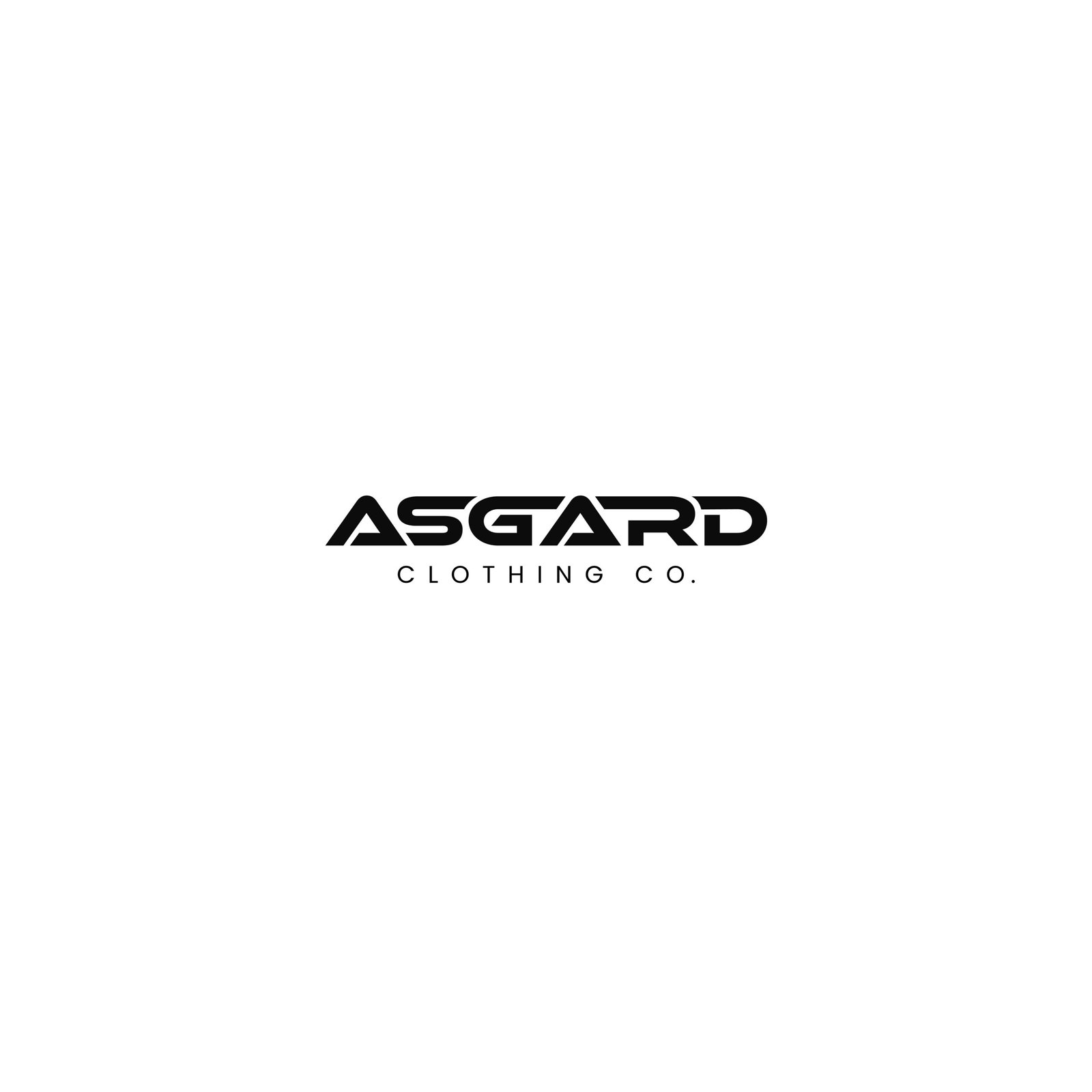
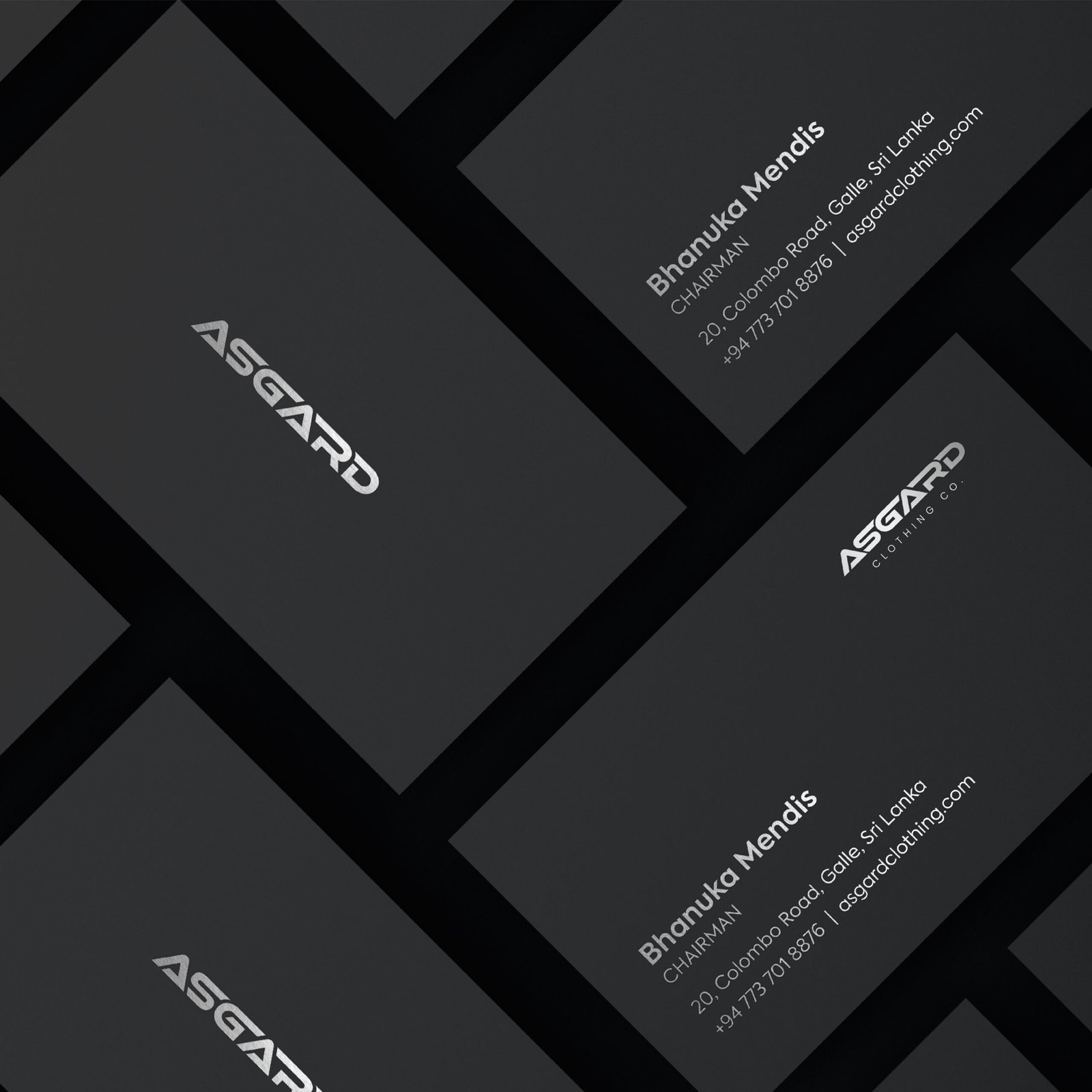
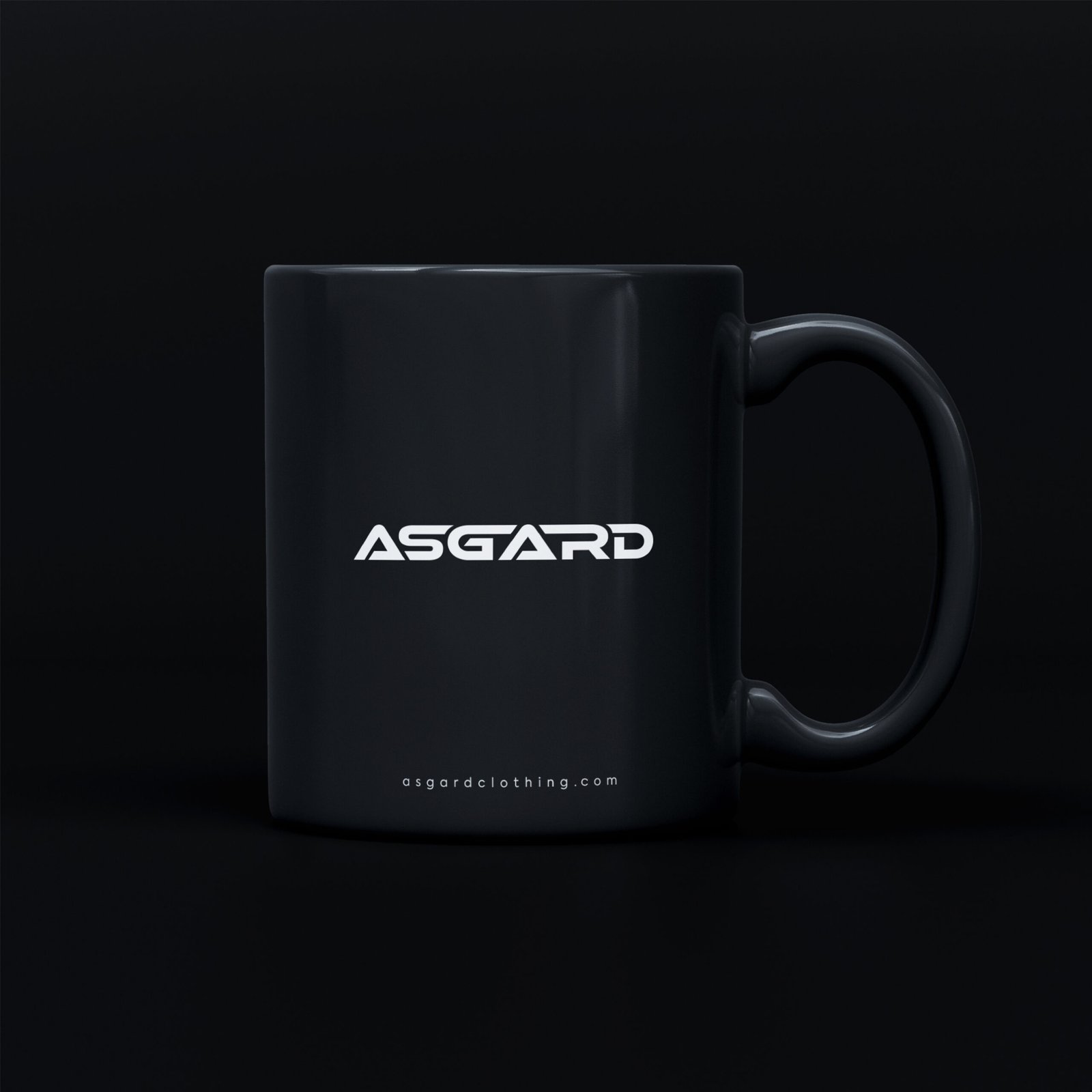
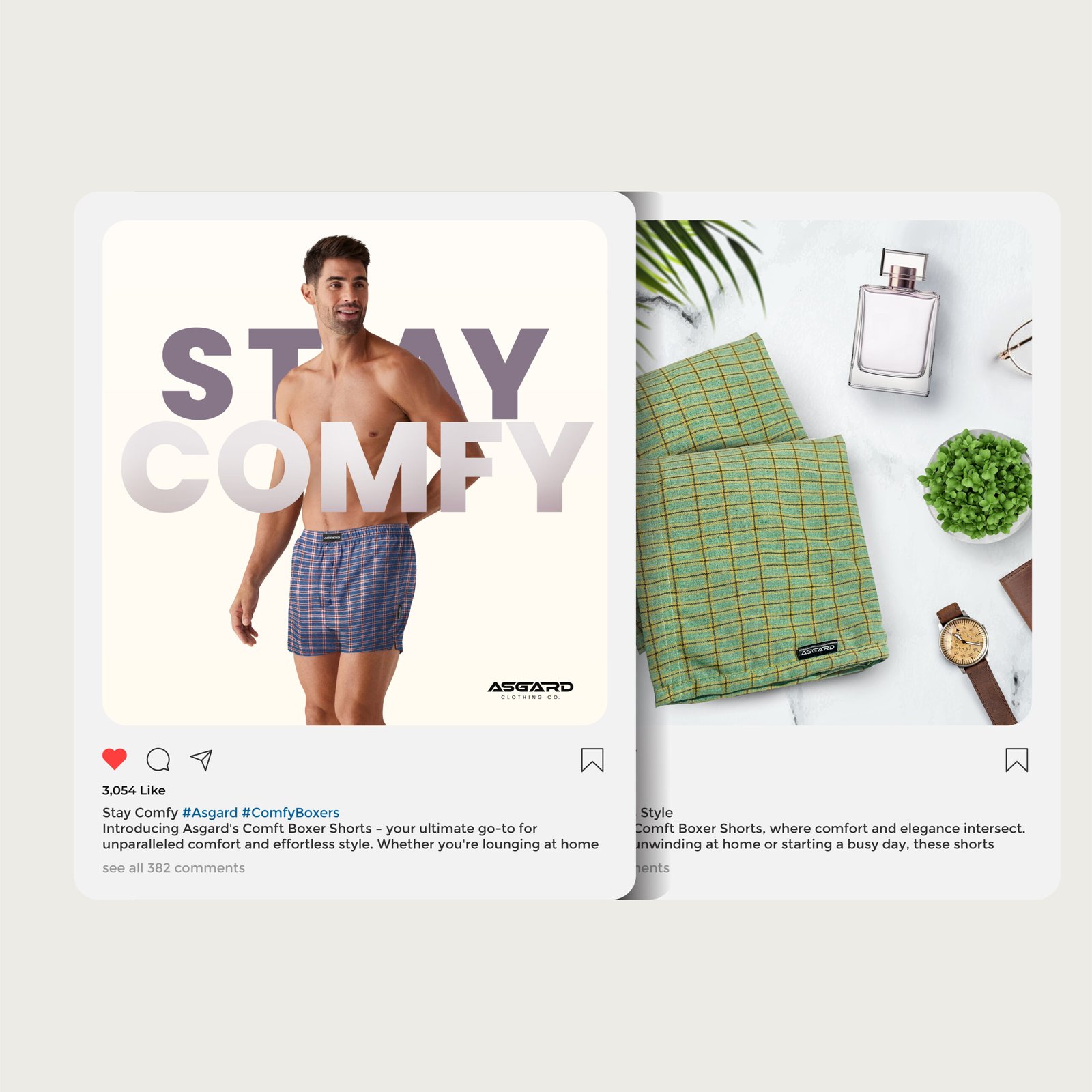
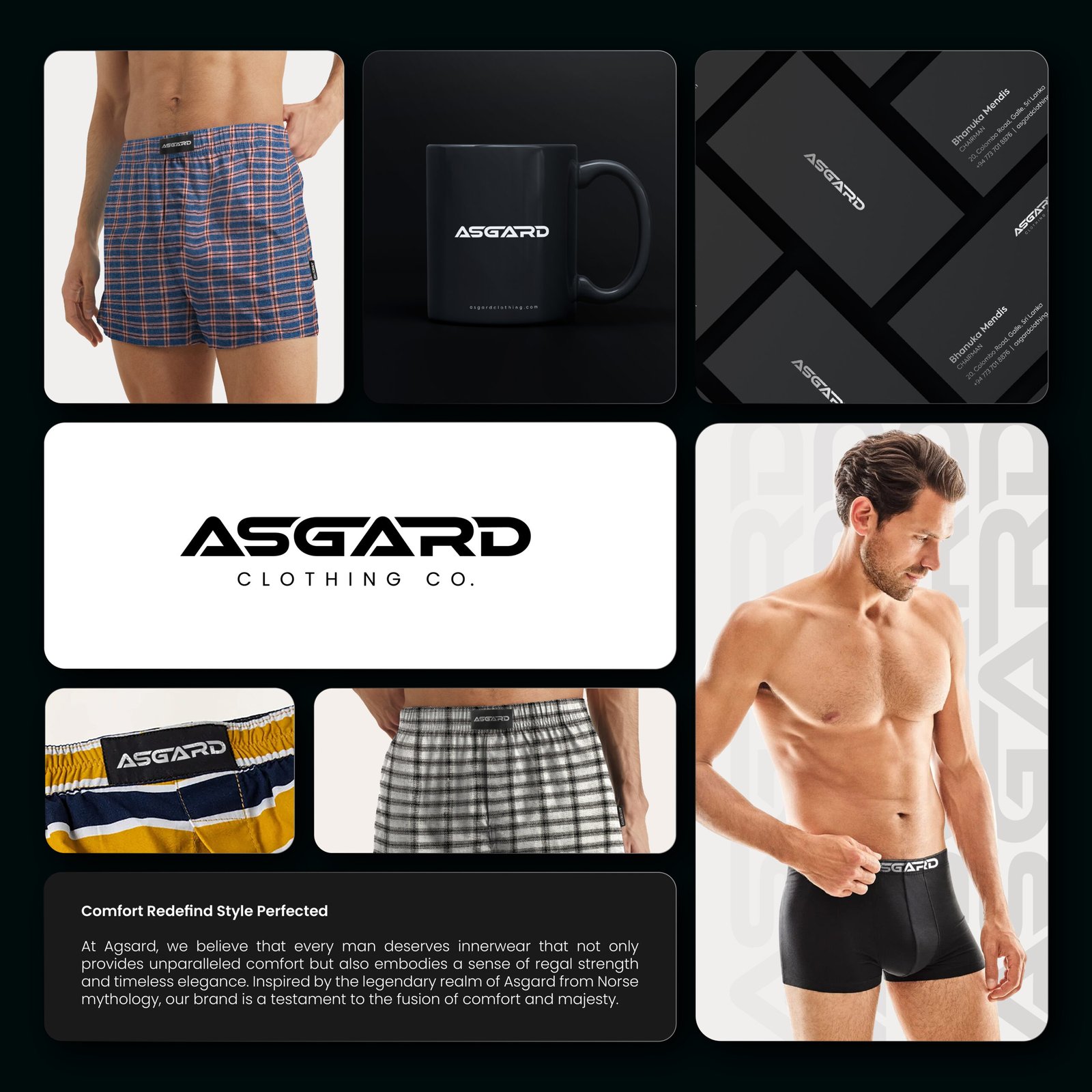
The final identity delivers a bold, minimalist logo system that exudes strength and precision. The comprehensive brand package includes logo variations, typography hierarchy, color system, product tag designs, packaging templates, and digital application guidelines. Every element is engineered for maximum impact at every scale.
“A powerful identity that truly represents what Asgard stands for. Bold, modern, and completely unique.”
— Asgard Management