
Renbake
Artisan Biscuit Packaging Collection
Food & Beverage • Packaging
Understanding the Vision
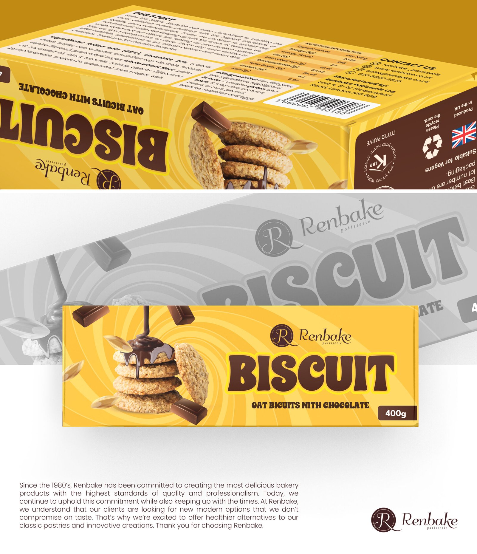
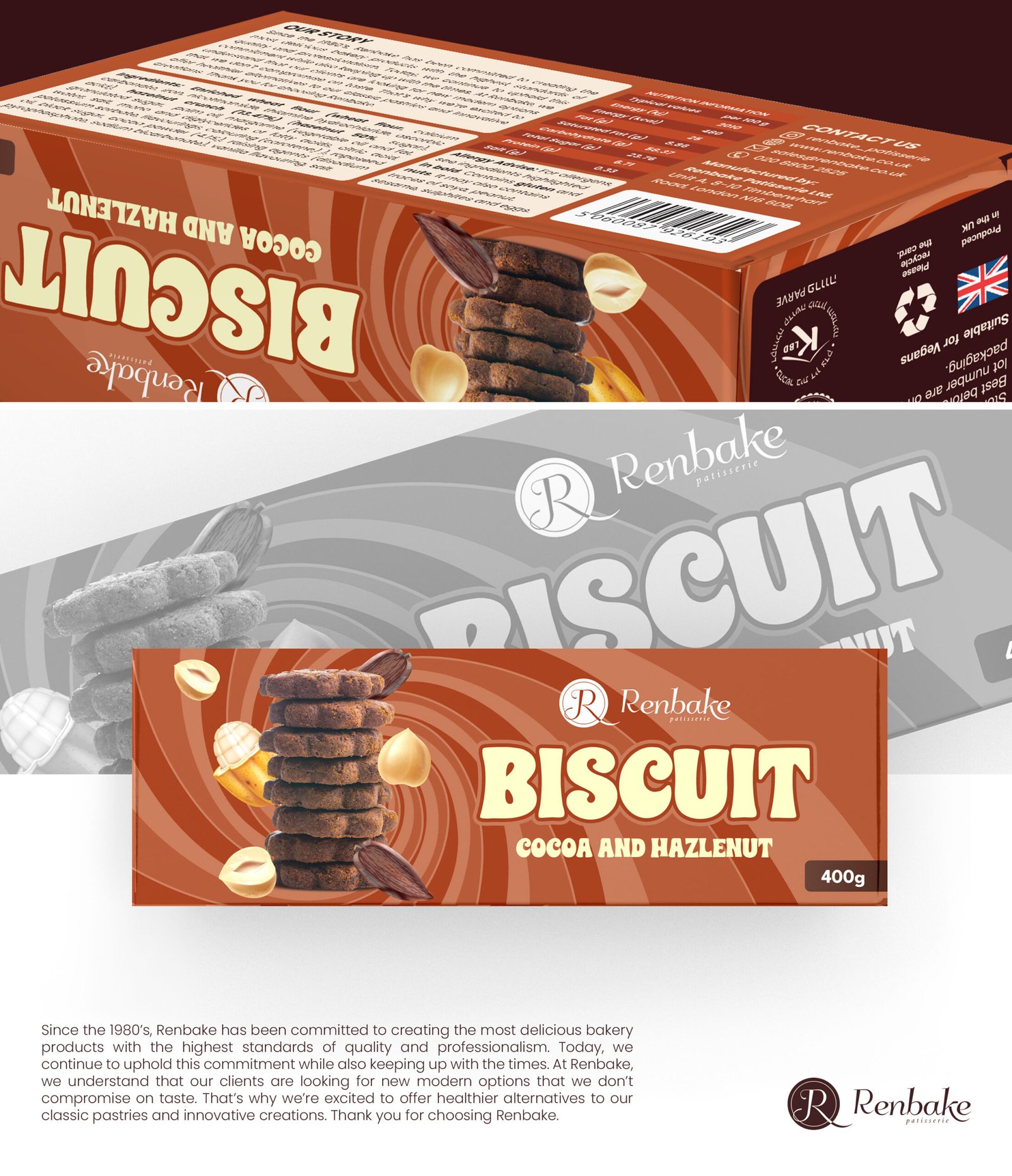
Renbake needed packaging that could compete in the crowded UK biscuit market while communicating their unique position: traditional recipes with a modern sensibility. The packaging had to feel homely and artisanal yet premium enough for specialty retail.
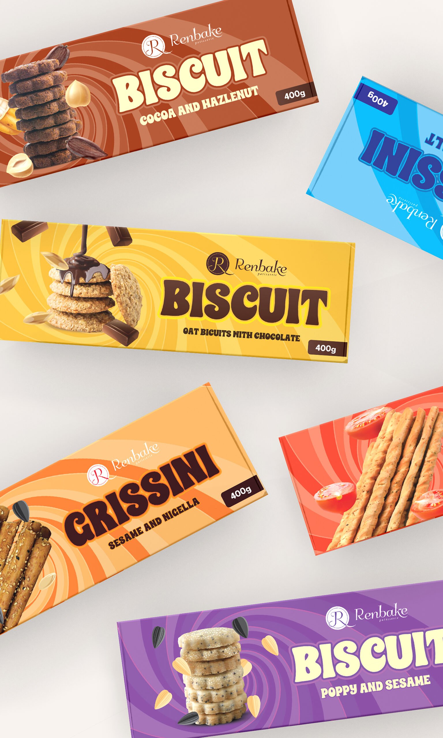
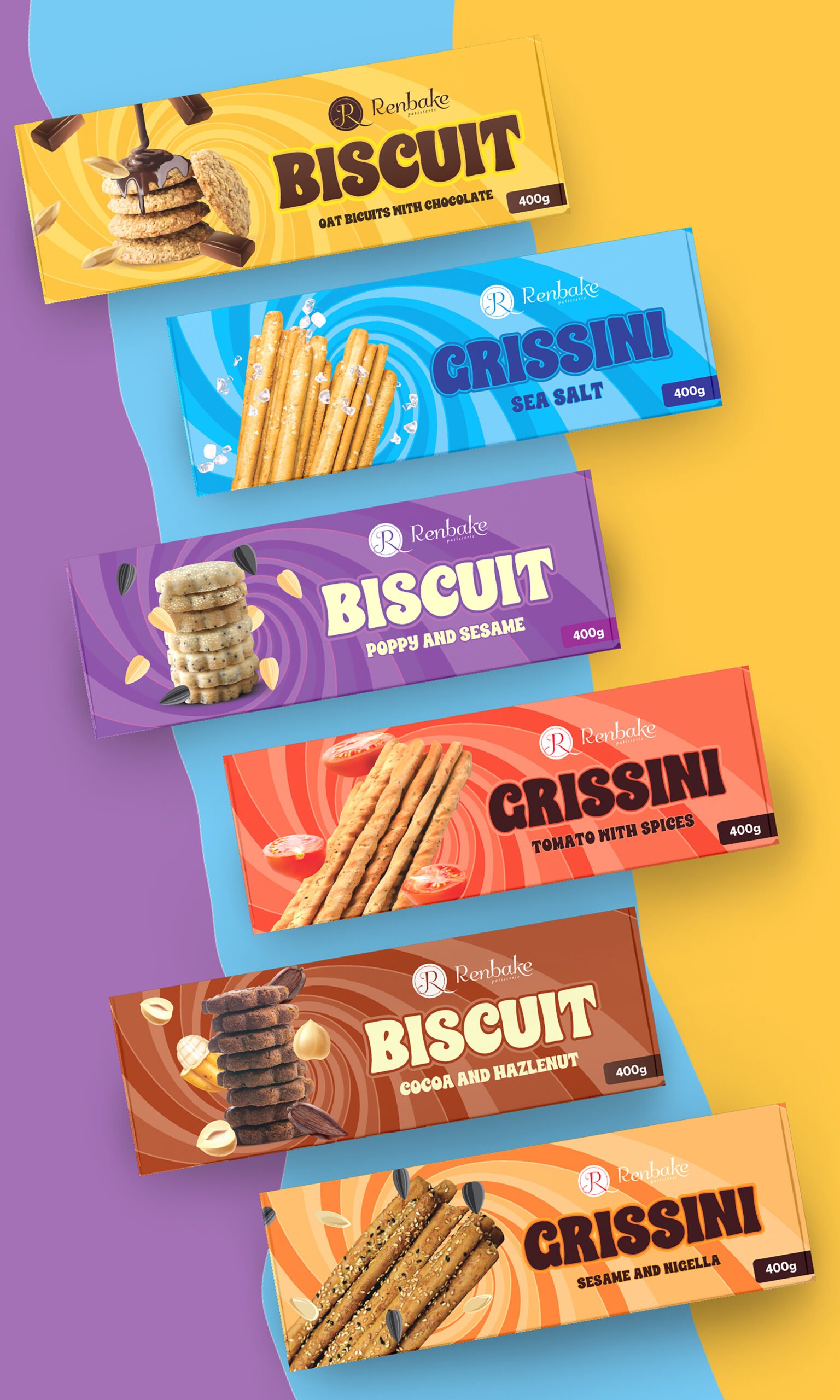
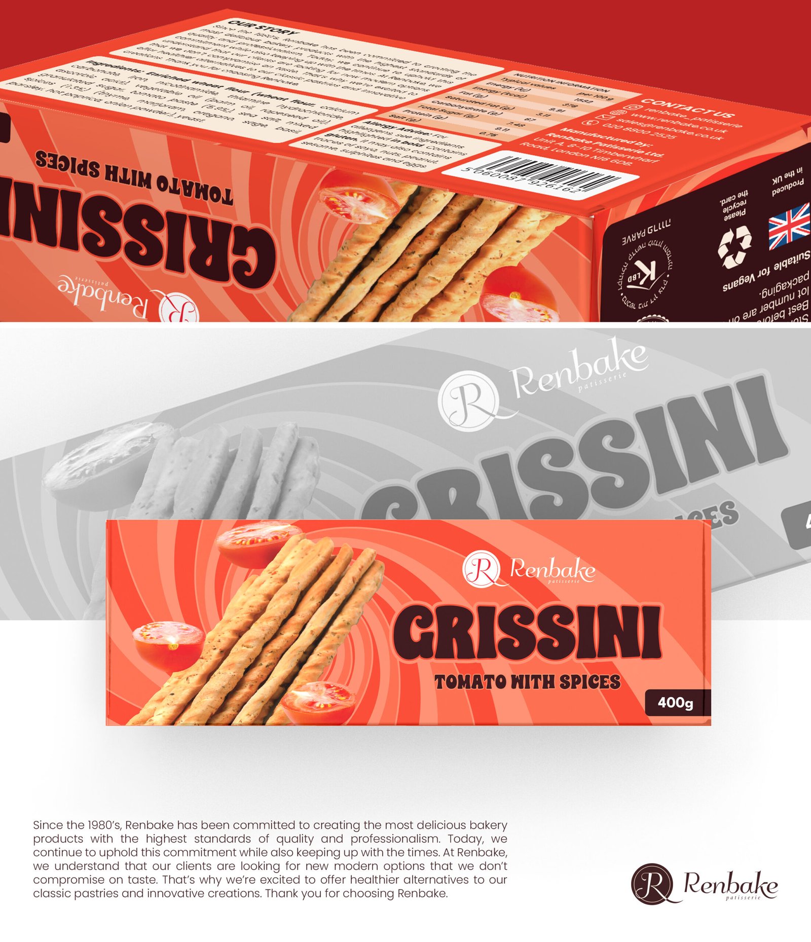
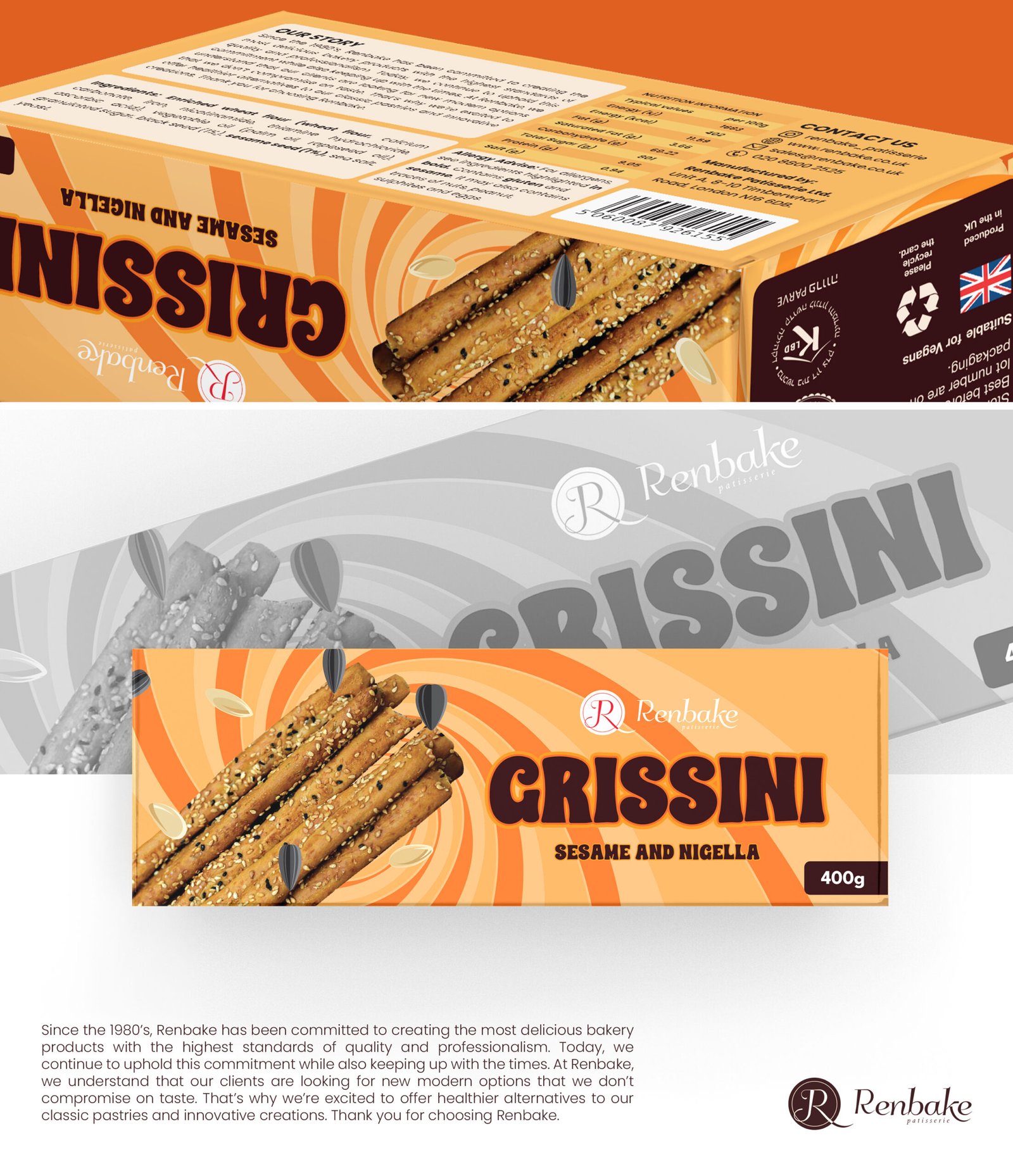
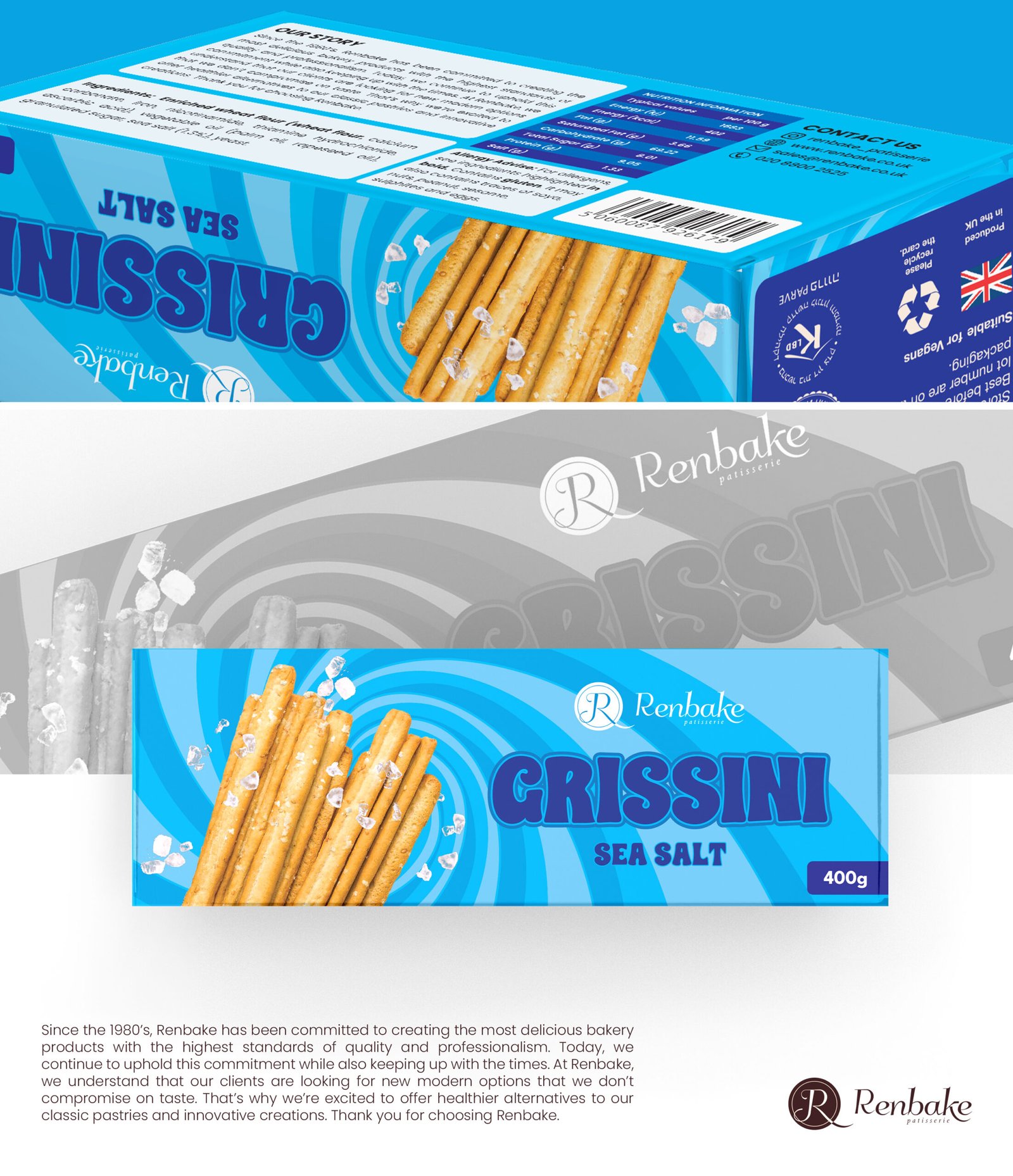
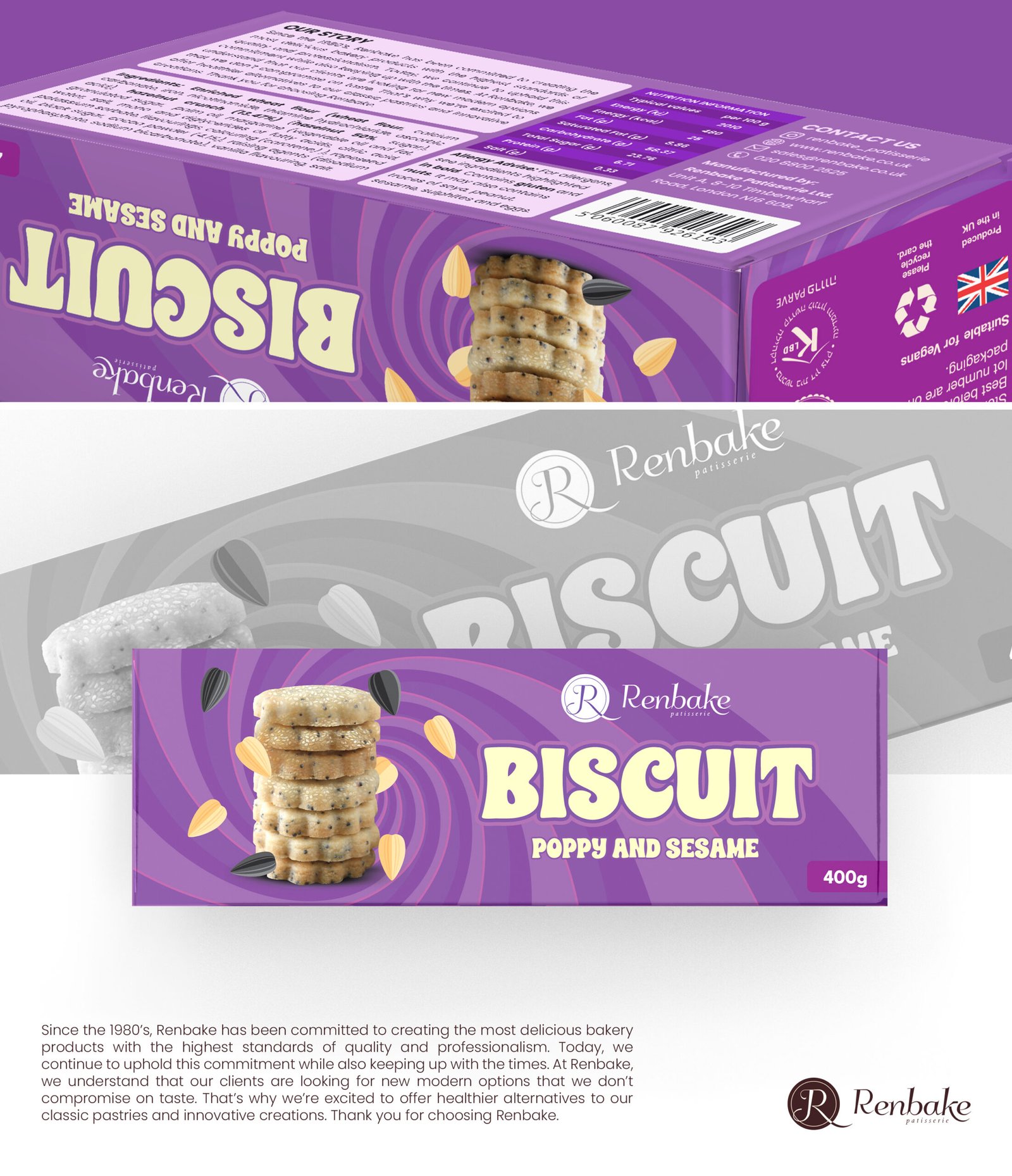
With multiple flavours in the range, each variant needed distinct identity while maintaining brand cohesion across the entire product line.
Strategy & Creative Direction
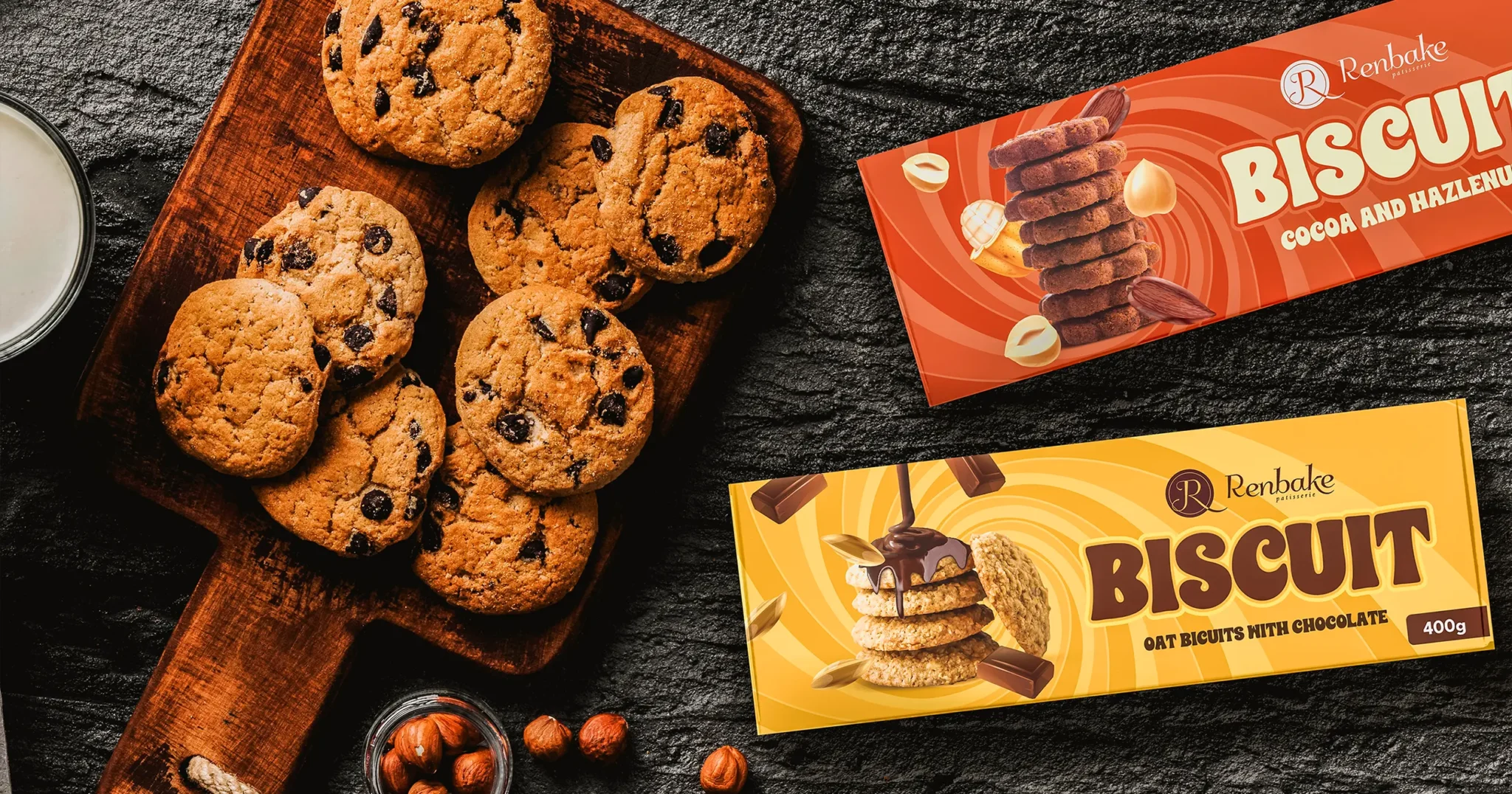
We developed an inviting visual identity using warm tones, hand-drawn flourishes, and bold typography reflecting the brand’s homely, artisanal roots. Each flavour was distinctly color-coded for instant shelf recognition while maintaining brand consistency.
The design balanced nostalgia with modern retail standards, ensuring the packaging worked both in specialty stores and online product photography.
Bringing It All Together
A complete packaging system with distinct colour-coded variants, consistent brand elements, and print-ready production files. The design positions Renbake as both premium and familiar — standout visuals reflecting the quality baked inside.
“Packaging that truly represents our homemade quality with a modern, premium look.”
— Renbake Brand Team